Final Project
1. Critiquing Process
a. Describe what exactly you see b. Analyze: Use the elements/principles to reflect upon the art form c. Interpret - what is the artist trying to say, what caused the artist to say it, what time period if the art form from. What style was used on this art piece. 4. Evaluate how successful or important is the work of art. My Critique Of stamp Project 1. Using Linocut to depict a panda. By scratching the surface and using various tools to create depth to avoid the paint to help create the stamp itself. Usage of Linocut is like opposite paper in some ways. You have to be careful because if you cut at the wrong parts you may have to change your entire piece. The art itself is good. Well placed lines define its shape. Despite the project being made for mostly lines, whereas this creates a more shape based object which helps it make it unique. The style is rather simple. There isn't a style that pops out to you directly. However maybe the direction of the cuts that helped define the panda's shape. I believe the artist is just trying to express themselves by drawing a panda. This art piece wasn't too successful in depicting a true meaning behind their work. It's kind of like it's just a panda no more and no less. Style is seriously important to help define what that panda all means. In the future I hope the style become definitive instead of lacking. Answer Three Questions 1. Q> - List some reasons that an artist would need to use observation when making artwork Whether it's deciding on what to draw or using a reference usually the artist can't just draw using perfect proportions without looking at something to help them. This can be from looking at a reference image to finding the object in real life and using that to draw directly from it. I think observing the world around the artist makes it easier to depict what the truly want to draw. Sometimes this means figuratively. 2. Q: what are some reasons artists make art Simple answer is money, better answer is to create. Some artists have to depend on their artist skills to get most of their income, which without a second job is extremely difficult. I also believe artists want to show the world what they think. Change something simple about a picture and sometimes you can change the entire meaning of the painting or art piece. Sometimes artists just want to become a better artist. So they might try and reach out and change their style to become more comfortable with their own style. There is no 1 reason for an artist since artists can be big or small. In general however artists want to represent something in their work, they also want the public's appeal because again they need that money. 3. Q: Do Over : if given the opportunity which project would you do over? I would redo my postcard because I feel like I could've represented my word a lot better than I did. I especially dislike how the marker turned out. I feel like it may have been more appropriate to paint the words on rather than use marker. After I initially used marker it looked fine, however over time it quickly faded until the words couldn't be seen. The words I wanted it to show was "See, if you can't do what you imagine, Then what is imagination to you?" from a song I liked. Next time I want those words to pop and become more of the piece. Also my use of chalk really just failed to make those words to pop and more likely helped it fade. I would really like to do redo that project. 4 > Medium which medium did you enjoy working with the most. I enjoyed the charcoal and just plain pencil. I thought they were easy to use and I could always find a pencil lying around. Sure, pencils don't always show the amazing colors other paints can do, but they can show depth. And pencils have many shades depending on how you use them. Charcoal on the other hand, it feels like you can mold mistakes into good mistakes if that makes any sense. Also for either of these mediums you can erase, so there is like a sense of security in that I can try something and undo it if I don't feel comfortable with it. A medium that I didn't use much was chalk. I liked it alright but it didn't feel right, it felt foreign in my hand and I wasn't sure if I was blending it the right way. When you are using pencils or charcoal you don't need to think about the color because it is only one color. |
|
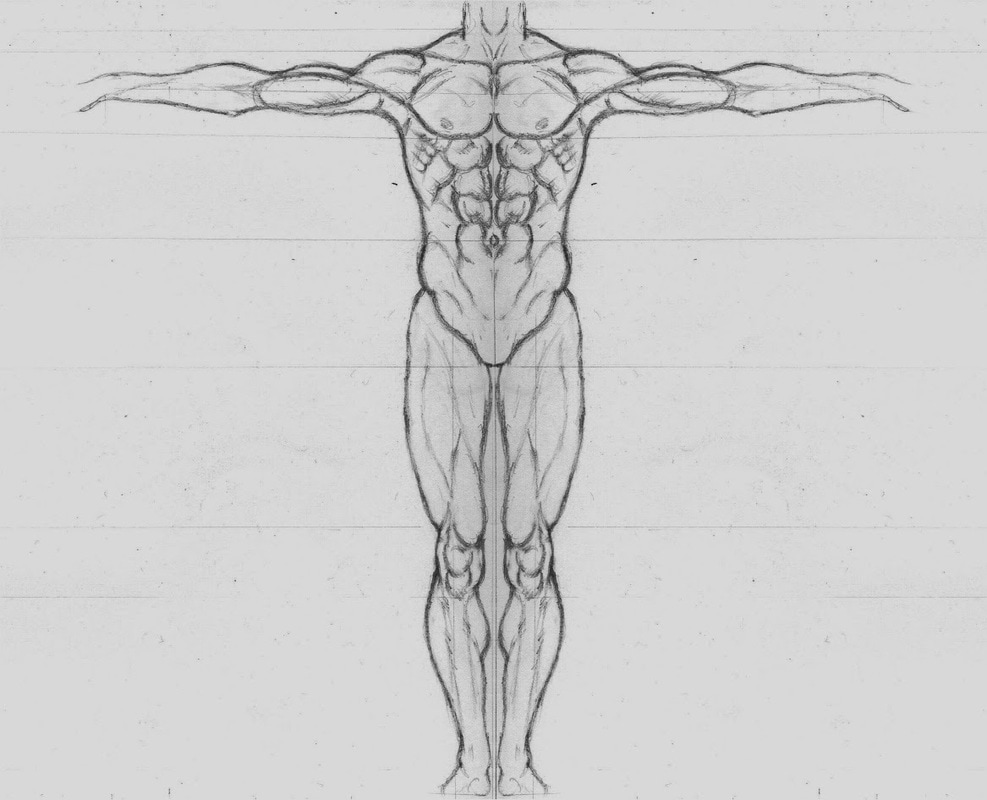
Reference images like this one help artists figure out how certain elements of the body should move. It keeps things looking natural and just right.
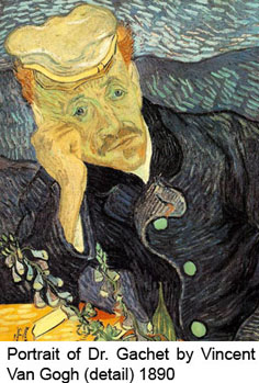
This picture creates a value using the expression of the person in the painting. You wonder what the artist was thinking and why he chose to use that certain style to paint that man.
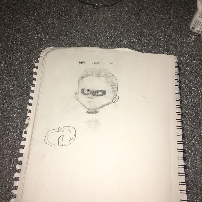
A penciled work I did with a reference. From a illustration Friday. I really liked shading in a trying to find ways to shade in Dash to make him more realistic. There are a lot of erase marks from where I messed up and tried to clean it up. If I had done this with another medium I may not have been able to so easily fix those mistakes.
Blog Post 1
Favorite Artist From Colossal
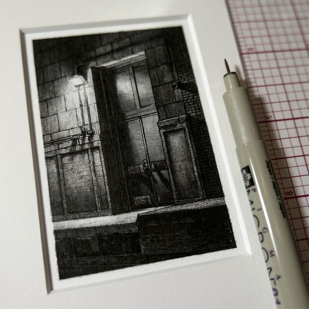
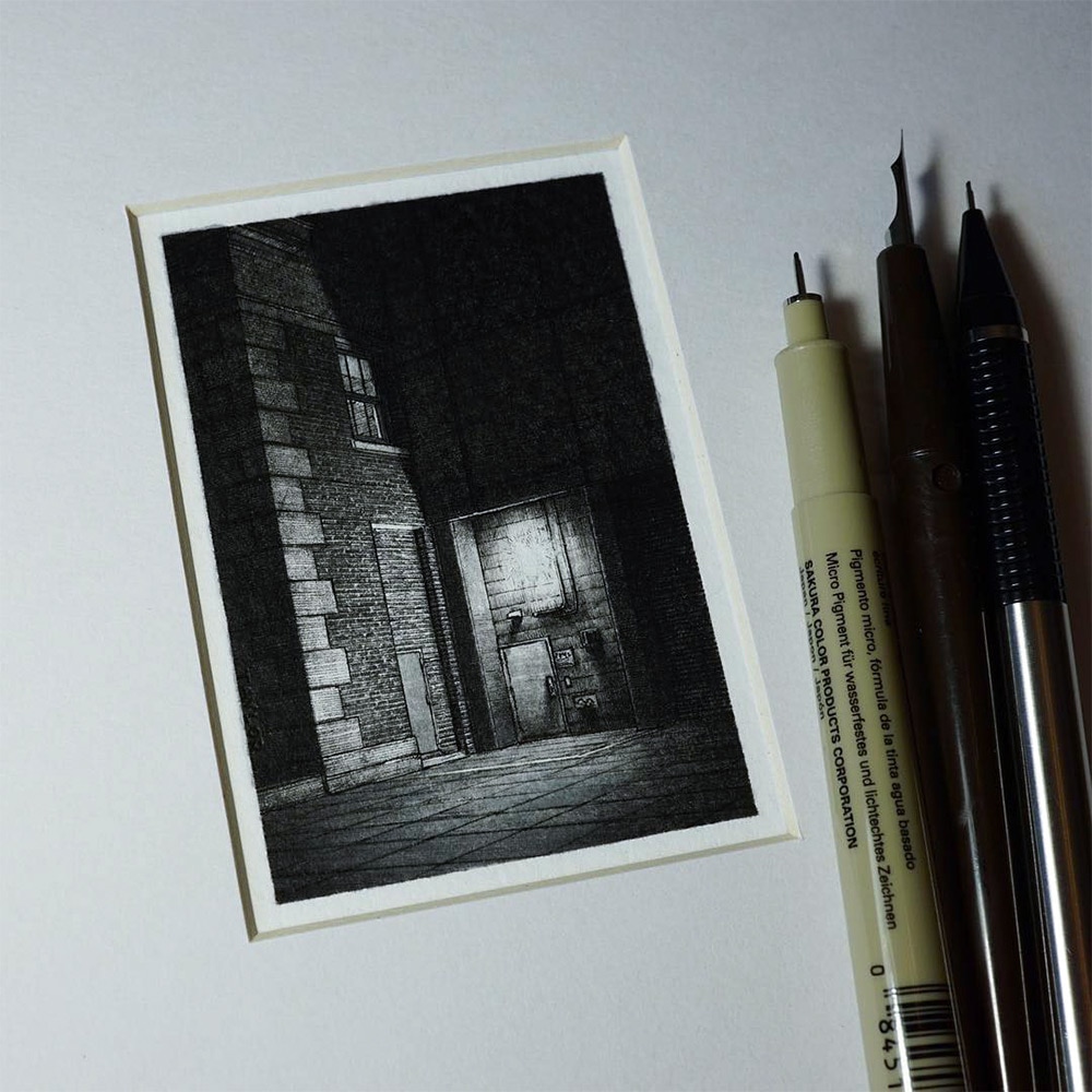
A Michigan artist named Taylor Mazer creates seemingly unimportant drawings, yet excels in creating small detail that might otherwise go unnoticed. This artist caught my eye considering how small the artist's work-space already is. I saw the real size comparison between the pens and the artwork. It was seriously amazing how much detail could be fit in that small paper. Their work inspires me because although they didn't create some new concept, they were able to express what was already there in fine detail. The lights and darks in this picture is definitely a great quality to be able to master
About the Artist
Mazer is a freelance artist and currently is adjunct to Kendall College of Art and Design in Grand Rapid. The artist focuses on alleyways and architectural details in their work.
Website/Shop for artist
taylordraws.com/#misc-drawings/1
Favorite Artist From Colossal
A Michigan artist named Taylor Mazer creates seemingly unimportant drawings, yet excels in creating small detail that might otherwise go unnoticed. This artist caught my eye considering how small the artist's work-space already is. I saw the real size comparison between the pens and the artwork. It was seriously amazing how much detail could be fit in that small paper. Their work inspires me because although they didn't create some new concept, they were able to express what was already there in fine detail. The lights and darks in this picture is definitely a great quality to be able to master
About the Artist
Mazer is a freelance artist and currently is adjunct to Kendall College of Art and Design in Grand Rapid. The artist focuses on alleyways and architectural details in their work.
Website/Shop for artist
taylordraws.com/#misc-drawings/1
Pen / Charcoal / Pencil Drawings Feb 8th 2017
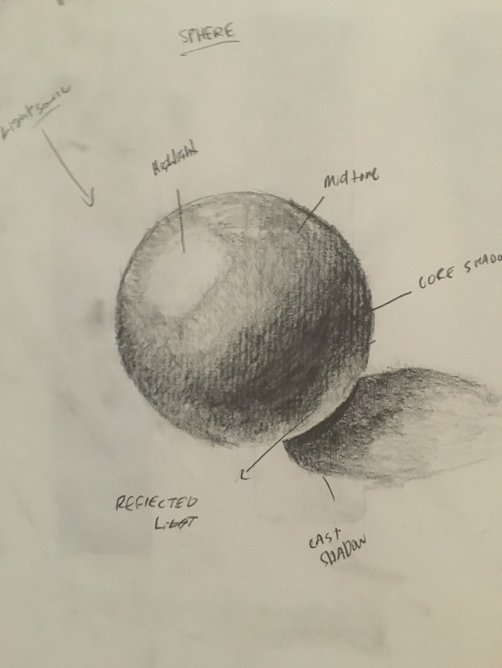
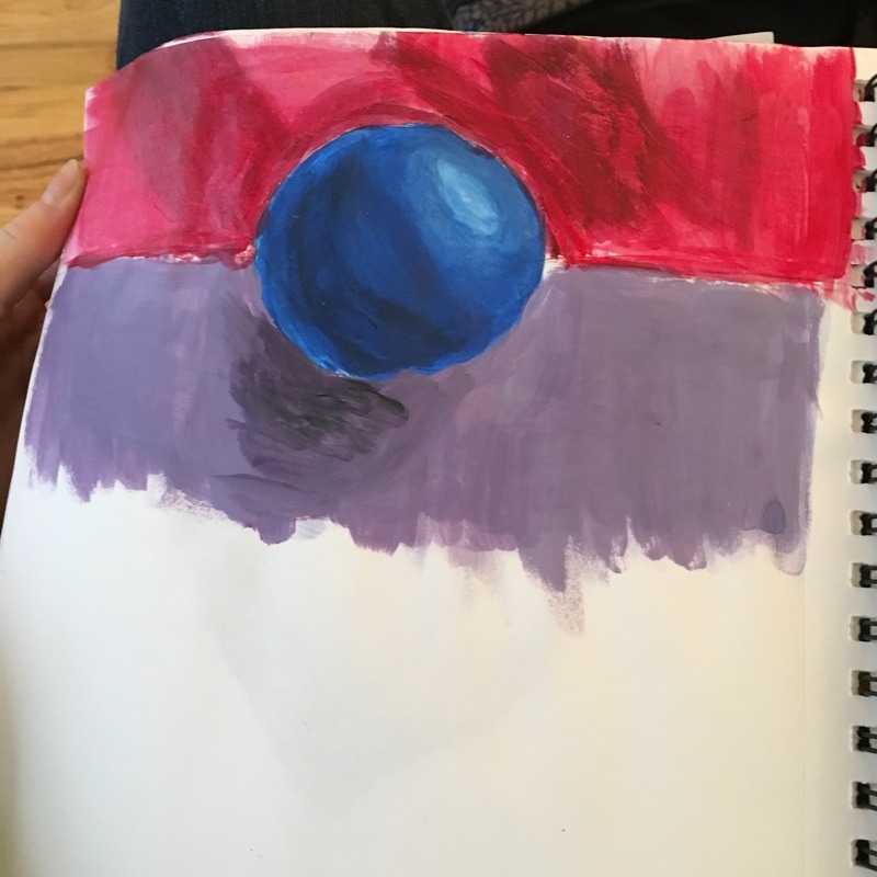
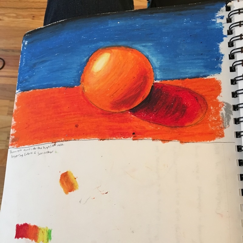
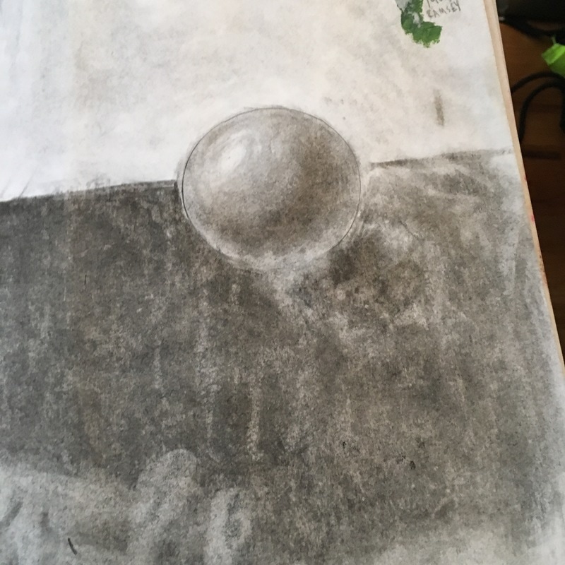
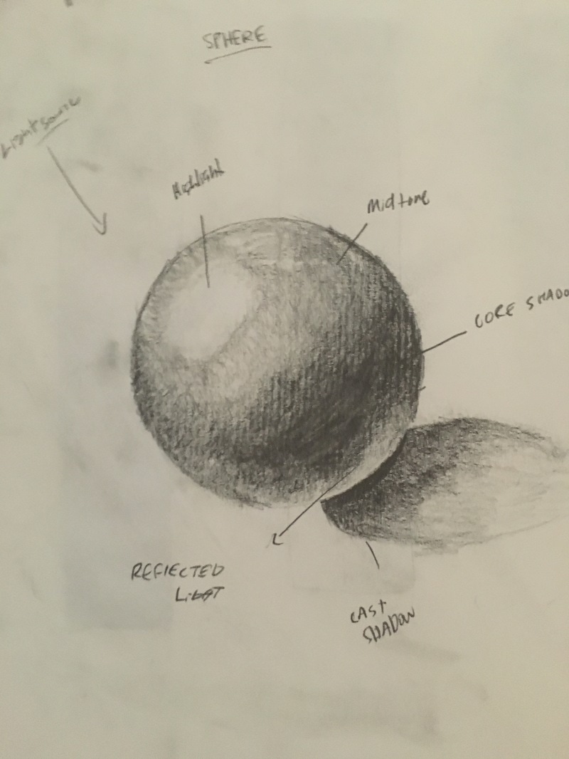
1 The most helpful warm -up during this unit for myself was drawing the spheres, before when I would try and draw 3-d I never recognized that the table or whatever it was standing on also reflected light. Since I did not know this when I tried to draw 3-d shapes they did not end up looking quite exactly right.
2 Composition is the placement or arrangement of visual elements or ingredients in a work of art (an example is the rule of thirds, optical center which is typically the center/right of something, and the Golden Spiral)
Value on the otherhand is the light and darks in a piece, these lights and darks can help define the shape of a work and can help create contrasts in the work.
3 Pros, Cons
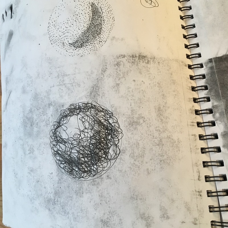
a Pen - Can define a shape easily, Is not erasable, also is sometimes difficult to indicate values with shading since you have to use types like stippling/ cross hatching.
b Pencil - Pencils are everywhere most people have them so they aren't expensive, the pencil ends up becoming dull easily unless you're using a mechanical pencil which most artists would probably not use anyway.
c Charcoal - Also Erasable, Has a easier shading ability (you don't need to cross hatch etc) blending is easier,. On the bad side this ability to blend also can make it smudge, I've heard from Drafting that the oils on your fingers are not good to go on the paper and can lead to unwanted smudging.
Intro to Painting
|
|
|
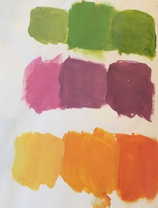
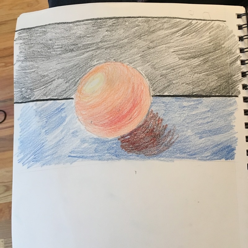
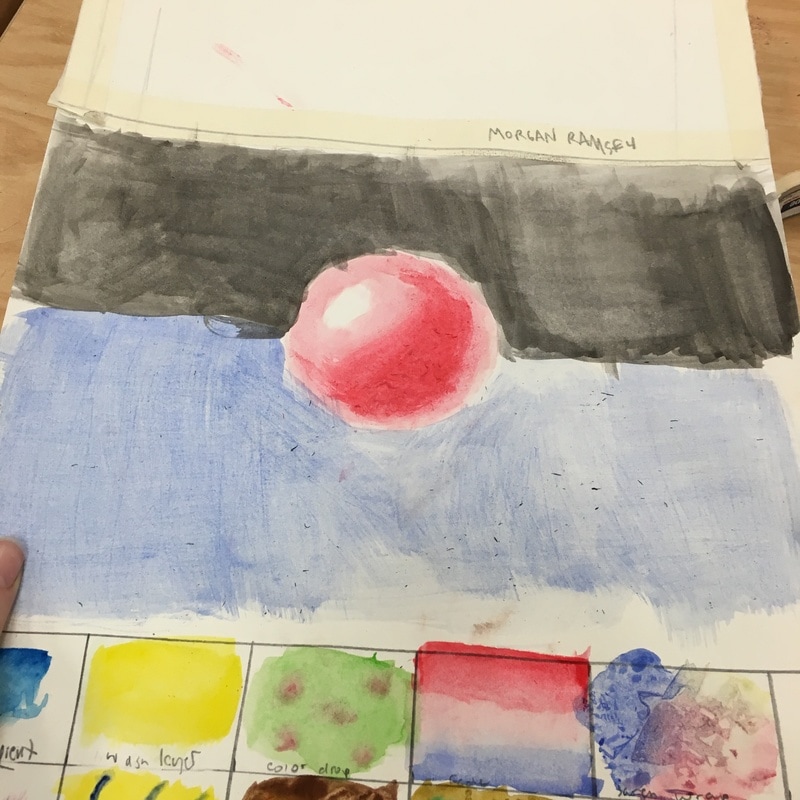
1. It was hard to mix the color swatches because if you mixed a bit too much with black to make a darker shade. If you used too much black it was really difficult to get back to your base color or any color of what you wanted.
2. We made the color brown by mixing a primary color with its complementary color. For example we used Red and Green.
3. I picked a bag of chips to create. I thought it would be cool trying to make the highlights and darker parts from the wrinkles and crinkles. This actually proved to be a lot more difficult than I expected. If I tried to pain that again, I would try to paint in the direction of each highlight and shadow to see if that would work out better .
|
|
|
|
|
|
|
|
1. My favorite medium is probably either just pencil or acrylic. This is mainly because both of these you can cover your mistakes. Pencil you can erase and Acrylic you can paint over.
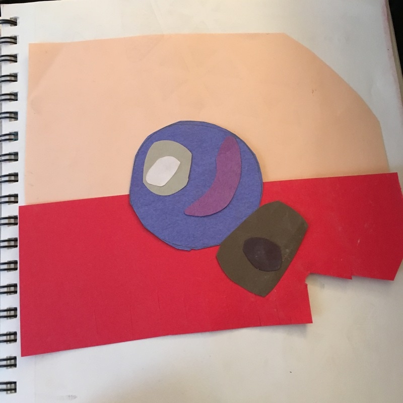
2. My least favorite medium is probably construction paper. I just feel like it's extremely difficult to create anything amazing with chunks of paper, also you can't really blend the paper.
2. My least favorite medium is probably construction paper. I just feel like it's extremely difficult to create anything amazing with chunks of paper, also you can't really blend the paper.
Pottery Unit
Still Working on it Post
2. What things have you found difficult so far? It was difficult for me to actually get the correctly sized squares. Even though I had a ruler I still had trouble because just because it's a straight line doesn't mean it's going in the same angle as the other cut I had. As you can probably tell the squares are still pretty uneven.
3. What do you find successful so far? I really enjoyed how many different things I could create with clay. You can make pretty much anything you can think of if you have enough clay.
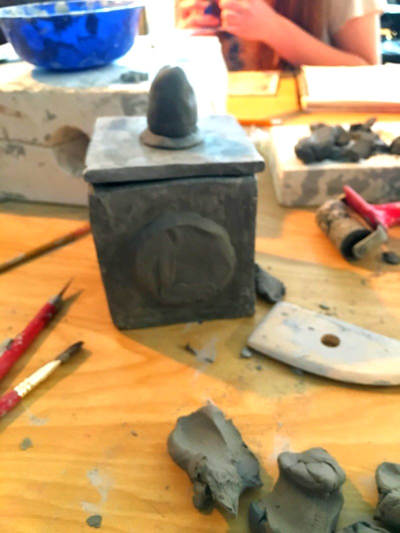
4. Explain your process up to this point. First I took a slab of clay and shaped it into the appropriate size. I moved on to building my base shape. I made sure to scratch and slip each of the sides and took my time making sure it would correctly mold together. After that I began working on the add-ons I would be having. After creating the add-ons I made sure to scratch and slip each object so they would stay on. Once this was finished I waited so that it could be fired.
Finished Project Post
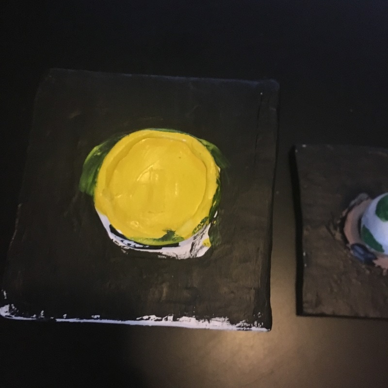
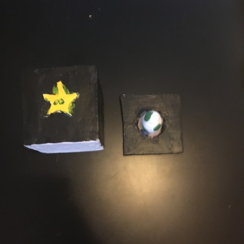
After Completing my in progress post, I worked on evening out the sides and securing the top. I also started painting it with acrylic paint. I decided on the color black so that it could contrast my other brighter colors. After I finished it, I put it in to be fired (I fired once before the paint). I did not add any glassware or glaze, I really like the way mine turned out.
I think this piece of successful in the color I used and my idea. I had a lot of different ideas in my head in the beginning. I think my ability to make things stick out on my project. Being able to have multiple items sticking off of it.
I would change the way I went about it. Sometime I couldn't focus and it affected how my project ended up looking. Not all straight edges and not always even. I think I would pick something more simple to recreate and add my own spice to.
Still Working on it Post
- What do you plan to do with your piece?
2. What things have you found difficult so far? It was difficult for me to actually get the correctly sized squares. Even though I had a ruler I still had trouble because just because it's a straight line doesn't mean it's going in the same angle as the other cut I had. As you can probably tell the squares are still pretty uneven.
3. What do you find successful so far? I really enjoyed how many different things I could create with clay. You can make pretty much anything you can think of if you have enough clay.
4. Explain your process up to this point. First I took a slab of clay and shaped it into the appropriate size. I moved on to building my base shape. I made sure to scratch and slip each of the sides and took my time making sure it would correctly mold together. After that I began working on the add-ons I would be having. After creating the add-ons I made sure to scratch and slip each object so they would stay on. Once this was finished I waited so that it could be fired.
Finished Project Post
After Completing my in progress post, I worked on evening out the sides and securing the top. I also started painting it with acrylic paint. I decided on the color black so that it could contrast my other brighter colors. After I finished it, I put it in to be fired (I fired once before the paint). I did not add any glassware or glaze, I really like the way mine turned out.
I think this piece of successful in the color I used and my idea. I had a lot of different ideas in my head in the beginning. I think my ability to make things stick out on my project. Being able to have multiple items sticking off of it.
I would change the way I went about it. Sometime I couldn't focus and it affected how my project ended up looking. Not all straight edges and not always even. I think I would pick something more simple to recreate and add my own spice to.
2-1 Project
|
2-1 Project
|
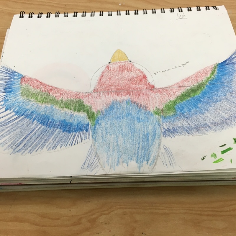
Reference Used
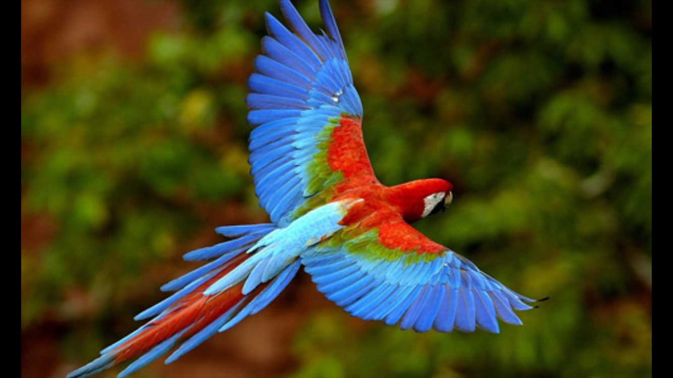
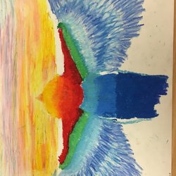
Finished Product, Mixing a Sunset with a Parrot.
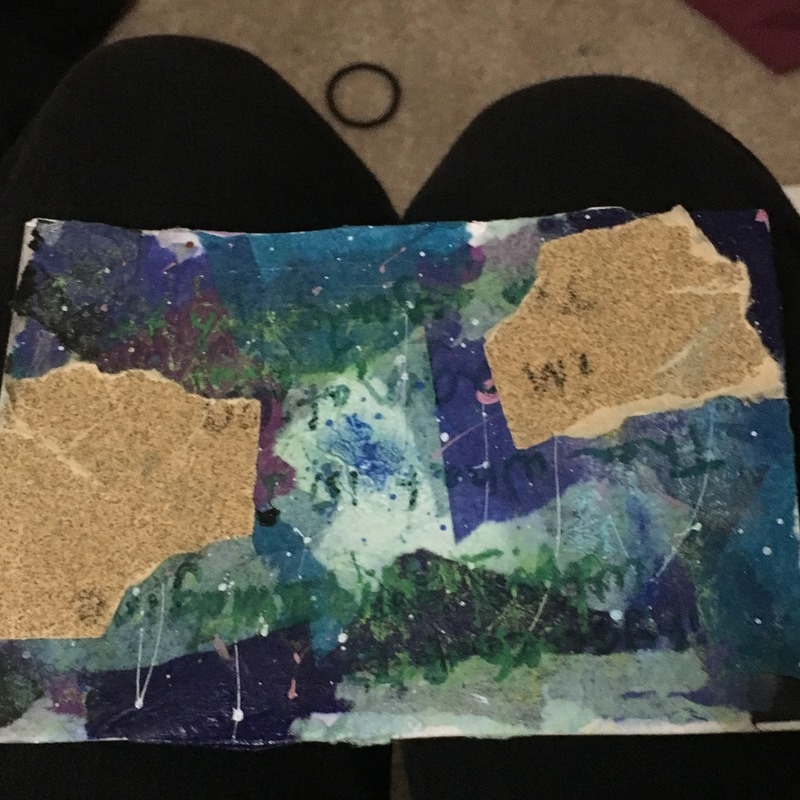
PostCard
Mediums used -
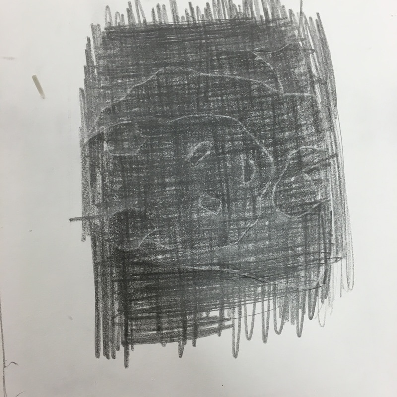
Sandpaper - I cut out pieces of sandpaper to represent the harder and denser parts that go on in your mind, the things that can't always be explained or it's too hard to talk about those things. , Paint Flicks - I used white and pink flicks through out the postcard. , Wrapper Paper - was the base that we all did. I chose to use the calmer colors, some of the pieces are darker to contrast with the lighter parts. , Marker I tried to use this medium to write some lyrics on it. It didn't turn out the way I wanted. , Chalk. - I added chalk to try and make the lettering pop.
Word depicted - Mind
I tried to depict it by showing how a mind would be. With the hard parts and keeping a calmer cool colors in it. I think next time I will try and make the lettering pop a little more.
Mediums used -
Sandpaper - I cut out pieces of sandpaper to represent the harder and denser parts that go on in your mind, the things that can't always be explained or it's too hard to talk about those things. , Paint Flicks - I used white and pink flicks through out the postcard. , Wrapper Paper - was the base that we all did. I chose to use the calmer colors, some of the pieces are darker to contrast with the lighter parts. , Marker I tried to use this medium to write some lyrics on it. It didn't turn out the way I wanted. , Chalk. - I added chalk to try and make the lettering pop.
Word depicted - Mind
I tried to depict it by showing how a mind would be. With the hard parts and keeping a calmer cool colors in it. I think next time I will try and make the lettering pop a little more.
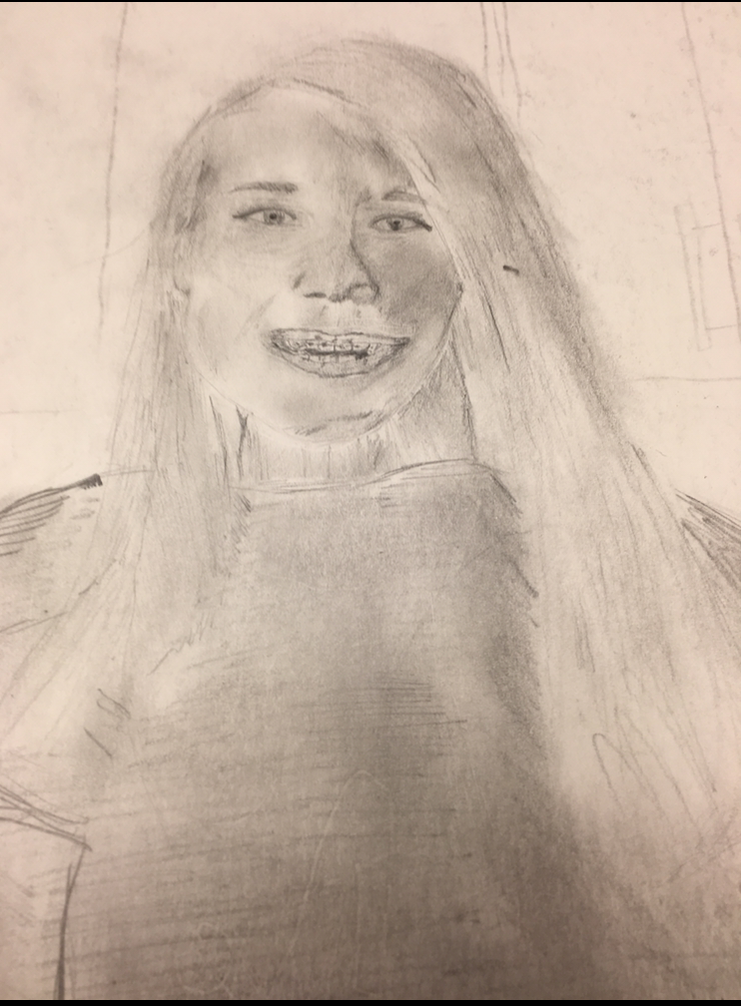
Last Project - Multi Medium Self Portrait.
( Pencil and charcoal)
I chose to do myself for my last project. I thought it would be a good idea to draw myself to try and reflect on what I learned while in art this semester.
Most of the shading is done in charcoal, while pencil outlines and defines some parts of the piece.
( Pencil and charcoal)
I chose to do myself for my last project. I thought it would be a good idea to draw myself to try and reflect on what I learned while in art this semester.
Most of the shading is done in charcoal, while pencil outlines and defines some parts of the piece.
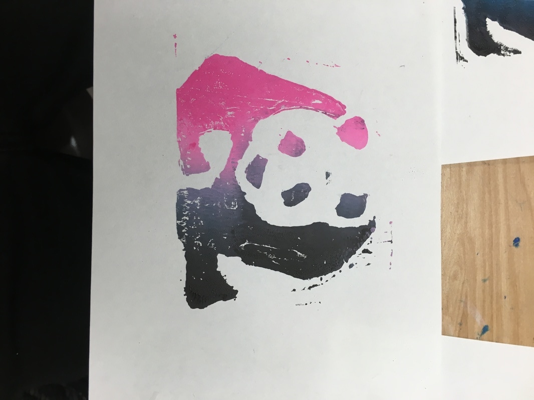
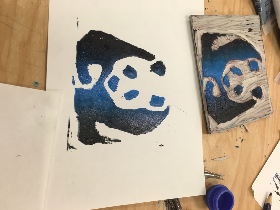
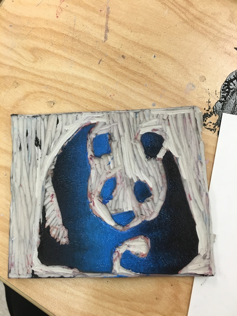
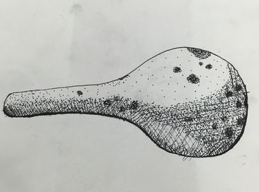
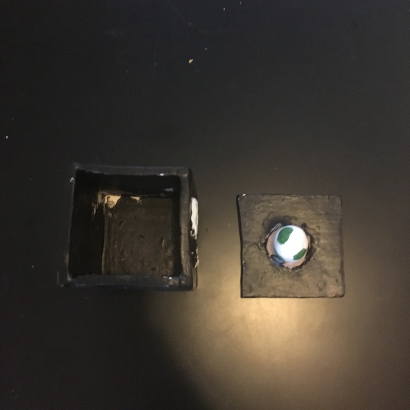
Above is my Stamps/ Linocut Project
My piece doesn't show off as much line as it does shapes, If you broke the panda I drew done into more simple pieces it would resemble a bunch of shapes.
If I had to do this project again I think I would attempt something harder or even create my own pattern. I think the panda turned out great, but I would've loved to have added something a little bit more. Also while I was doing this project and using the tools, If I made a mistake, it sometimes meant I would have to completely change my plans on how I would create my stamp. For example If I cut too deeply I would have to change the depth of the entire figure as well. Also my usage of color. My first few attempts of stamping it didn't work out due to the color problems. In the future I'll be able to use color theory to help know better choices for the print.
Friday Illustrations
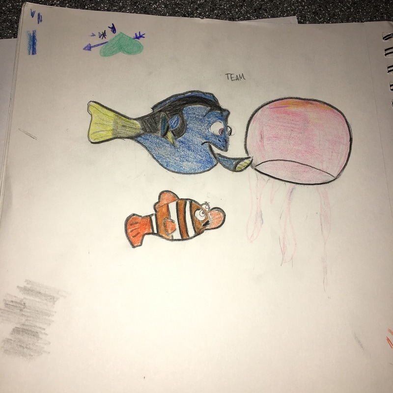
This is my friday Illustration for the word "Team"
I decided to depict Marlin and Dory from Finding Nemo. In this particular scene Dory is about to touch a jellyfish and Marlin is trying to stop her. I think this shows how they were a team despite being very different. I first sketched it out in pencil, and then decided to color it with Riley.
I decided to depict Marlin and Dory from Finding Nemo. In this particular scene Dory is about to touch a jellyfish and Marlin is trying to stop her. I think this shows how they were a team despite being very different. I first sketched it out in pencil, and then decided to color it with Riley.
Second Illustration Friday
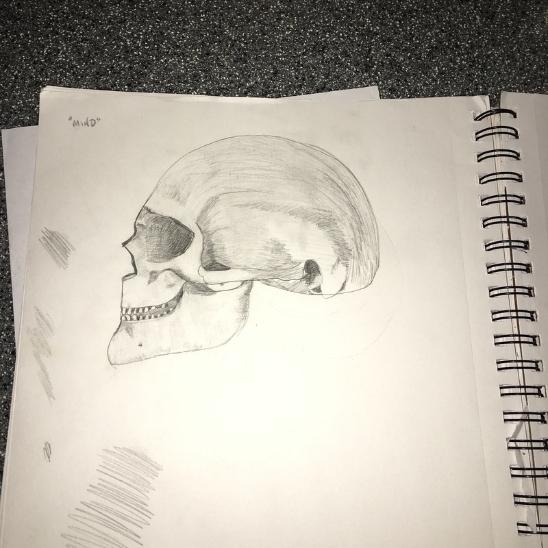
The next Friday Illustration I did in pencil word "mind". I think pencil is my favorite medium because you can erase it no biggie, and most of the time you have a pencil or pen on you. Anyways, I used a reference for this picture and tried to shade it how it was shaded. I can't find my reference picture now. I really like how the cross shading turned out and most of the left part of the skull. If I had more time I kind of wanted to add the right part of the skull broken where you could see balloons to depict what was inside. Regardless I think it turned out pretty well
